
I also remember the seamlessness of iTunes: importing my considerable collection of CD's and allowing them to mingle with new music I was purchasing from the store at $0.99 each. I was hesitant to commit to a purely digital listening experience and clung to buying CD's for a couple of years afterward, but by 2007 I was a full-fledged believer and haven't bought a physical CD in some years.
iTunes seemed almost as magical as the iPod itself: add your music, plug in your iPod, hit the "Sync" button, and voila! Your music in your pocket!
As the iPod continued to evolve, so did iTunes. In addition to music, we were soon able to purchase music videos, movies, and listen to podcasts; and all of it could be synced with our beloved iPod.
Then the iPhone and the App Store arrived. Soon, customers were downloading their entertainment on the go. No need to "plug in" to iTunes. You want a new album to listen to? Go get it! It's right there in your hand!
To say that iTunes has not aged well in the post-smartphone age is an understatement. The program continues to be an amalgamation (or abomination) of functions that seem both half-baked and antiquated. Even the name, "iTunes" harkens back to an era where digital music was a novel concept. It speaks nothing of the full breadth of content the app attempts to juggle.
The end result is a convoluted mess that tries to balance a plethora of functions, but does none of them particularly well. Following a redesign that attempted to give iTunes a "simpler" interface, Apple recently returned to the classic "sidebar" after users complained of not being able to navigate the app intuitively.
Speaking of which, has anyone tried to import a CD, lately? Let's put aside the fact that Apple doesn't include an optical drive on any of its computers (save for the aged 13" Macbook Pro that's cleverly hidden at the bottom of its webpage). Let's just focus on the act of importing a CD. Upon inserting the disc, iTunes will, with an impressive degree of reliability, search its database to see which disc you've given it. It automatically fills out track names and will even grab the album artwork. In most cases, it will ask you at once if you want to import the disc into your library.
Now, if you're like me and a little OCD about your music, you like to have everything conform to a particular standard: most of my music is imported at 192kbps (a nice balance between quality and storage). Since I hadn't imported a disc in years, and never configured the import settings on my iMac where most of my music is stored, I figured I'd double-check my settings. So when iTunes asked me if I wanted to import the disc, I said, "no." Instead I went into the Preferences to find out what my import settings were.
Confirming the settings was one thing. Getting back to the disc was quite another. Even now, I can't recall what I had to click to get back to the "Import" screen. Suffice to say there was some Googling involved. (Keep in mind, this was before Apple restored the sidebar, which clearly shows the disc as a mounted device in iTunes).
Okay, that's a minor complaint. Aside from audio enthusiasts who crave pristine, CD-quality sound, I can't imagine there are too many people importing CD's into iTunes these days. I could go on about the many issues with the Music portion of iTunes (like iCloud Music wreaking havoc on users' libraries), but let's see what else goes on in iTunes.
Video. Sounds simple, right?
iTunes breaks video down into three primary categories: Movies, Music Videos, and TV Shows. Once purchased from the video section of the iTunes Store, they appear in their respective sections in iTunes. That's all well and good if your primary viewing experience is in front of your laptop or desktop. But this is the age of AirPlay and Chromecast. The idea of sitting in front of a dedicated device to watch anything other than a YouTube video is archaic.
So let's pull that video up on our iPad, shall we? You'll stumble a bit, here, if you're a first-time iTunes movie user. Whereas video is an embedded function in the iTunes desktop app, Video is its own dedicated app in iOS. So rather than clicking on the Music app (whose icon still bears a resemblance to the desktop iTunes client), you're actually going to click on "Video", and then navigate to the kind of video you downloaded per the three categories above.
Downloading a podcast? Same deal. You can subscribe to and sync your podcasts in iTunes. You would think the Music app would be where to find them on your iPhone (I mean, it's still audio, at least). But Podcasts is its own app as well, and unless it's something you use regularly, you'll likely have to remember where you left it when you moved it off the main pane of your Home Screen.
There's little consistency to the design language between iTunes and its iOS counterparts. What was once seamless and "magical" is now confusing and frustrating. Finding content in iTunes is vastly different from finding it on your iOS device, and that's not even including a device like the Apple TV, which while similar to iOS, speaks yet another design dialect.
What's baffling is that Apple has already established a more consistent design language for its apps, but only in a few instances.
Firstly, there is iBooks. Granted, iBooks are still synced via iTunes, but the actual purchasing and reading of iBooks is delegated to its own app both in iOS and OS X. If I want to download a digital copy of Treasure Island, I open the iBooks icon on my Mac and purchase the book. With my Apple ID, the purchase is synced over iCloud, and I can pick up my iPad, open the iBooks app, and see that the book I just purchased is ready for me to read.
Furthermore, we can take the iWork suite of apps: Pages, Numbers, and Keynote. Each of these apps allows me to create content on my computer, save it to iCloud Drive, and open it on my iPad or iPhone using the same, respective apps.
Anyone who's used a 90's-era Macintosh may remember AppleWorks: the Apple equivalent of the ubiquitous Microsoft Office suite. It had one icon. Clicking on it presented you with a choice of what you wanted to create: a word processing document, spreadsheet, slideshow, or database. It was the "iTunes" of Apple office software. At the time, it was convenient not having to scroll through the hundreds of programs on my Mac to find the one function of AppleWorks I wanted. This philosophy is probably the reason Apple is hesitant to disband iTunes in 2016, but it actively conflicts with their overall design.
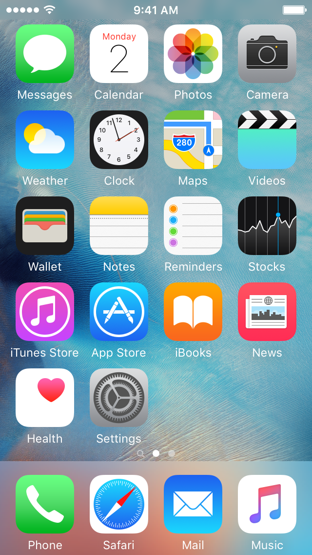
A couple of years ago, Apple overhauled the look of its desktop operating system to more closely resemble the look and feel of iOS 7. There's a clear dedication by Apple to develop a uniform language for its interfaces across mobile and desktop platforms. The Pages icon in OS X is the same icon I click on in iOS. The same goes for Maps, Notes, Calendar, Mail, Safari, Contacts, and many other native applications, the exception being iTunes.
For people who own smartphones (regardless of platform), iTunes is largely obsolete beyond the scope of media playback. Virtually all the content I can access in iTunes is accessible directly from any of my devices. But playback is still important. If I'm writing, I don't want to have to type on my laptop while relying on my iPhone for something to listen to.

With iCloud, Apple promised us a world in which our mobile devices would no longer be tethered to our aging, stationary desktop computing lives. To fully embrace that future, we need to cut our dependence on legacy apps and services. At the backbone of its "magic", Apple has long contended that "less is more." In this case, however, "more" may be "less."
No comments:
Post a Comment