Thursday, December 21, 2017

Why Apple is Not the Devil For Slowing Down Older Devices

News broke this week that Apple's recent software updates were deliberately throttling performance on older iPhones, leading consumers the world over to cry foul and demonize Tim Cook and Company for allegedly forcing their customers to buy new products when their old ones were working "just fine."  I won't try to dissuade anyone looking to switch smartphone brands, but hopefully I can shed some light on what's actually going on, rather than what the media and "squeaky wheels" want you to believe.


1.)  Why is Apple Throttling My iPhone?


This is a contentious point, but basically, Apple's stance is that it's throttling your iPhone's performance for its own good.  On the surface, that sounds like a load of bull.  And taken at surface-level, it is.  But dig deeper, and we find that it may not be the hot air you think it is.

As users, we judge our phones largely by how smooth the experience is.  Once we start to notice that a phone is "lagging", freezing, or losing battery life more rapidly, we generally make the mental note that its days are numbered.

The most common case is when a new version of iOS or Android is released, and the increased demands of the new operating system send our aging phone to a screeching halt.

So let's talk tech for a second.  Everything your phone does is driven by it's processor (CPU).  That piece of hardware works harder the more you ask it to do (i.e. play music while browsing the net and taking a phone call).  The more the CPU works, the more battery power is needed to keep the processor running so that you don't notice any dip in performance.  The harder the battery and CPU have to work, the hotter the phone gets.  And if Samsung's Galaxy Note 7 has taught us anything: hot phones are bad.  Very bad.

Fortunately no iPhones have reportedly exploded due to high performance demands.  However, many of them were caught randomly rebooting while users were in the middle of using them.  Why?  Because the battery was getting too hot and rebooting the phone was the quickest way to cool things down.  Terribly inconvenient and sloppy, but at least your phone wasn't exploding in the middle of your YouTube or Netflix binge.

This became a huge issue as thousands of users reported to Apple that their phones were constantly rebooting in the middle of the day.  So what did Apple do?  They released a fix.

What does the fix do?  In short, it limits how fast and hot the CPU can run, thus limiting how much power it consumes, thus limiting how hot the battery could get, thus eliminating up to 80% of the random reboots users were experiencing.

The trade-off?  Users began to see drastic changes in performance.  Since their CPU's can no longer run as fast as they used to, their phones began to struggle to do a multitude of tasks that used to be common and breezy.


2.)  Which Phones are Affected?


This is another piece to the puzzle.  Many people have taken to holding onto their smartphones for years, since we no longer have the obligation of 2-year contracts expiring and telling us it's time to upgrade.  So people are still out there rocking their iPhone 6, 6s, and 7.  And that's great.  Those are great phones.

The 6 and 6s, specifically, are the devices most affected by these updates.  That's no coincidence.

As a brief look at Lithium-Ion Batteries (the kind of batteries inside most smartphones, tablets, and laptops) will tell you, the average battery will lose 2% of it's longevity every month: so after 50 months (or just over 2 years), most batteries cannot be expected to perform as well as they did out of the box.  Even more of those batteries will begin experiencing performance issues long before that.

The rate at which a battery discharges is influenced by many factors, one of which is--you guessed it--temperature.  Another reason to keep things running as cool as possible.  Remember how your dad used to shove batteries in the fridge when he wasn't using them?  That was to keep them from discharging as quickly as they might have if they were left at room temperature.  It's a small difference, but it compounds the hotter things get.

The batteries in the iPhone 6 and 6s are long past the 2 year mark.  In fact, most professionals would recommend paying for a full battery replacement or buying a new phone altogether.  Instead, Apple is doing its best to prolong the life of your phone.  Again, the trade-off is, it won't play as nicely with the newest software as we now have to balance performance with temperature and power consumption.

The good news is, if you have a newer phone (iPhone 7/7 Plus, 8/8Plus, or X), you are unaffected by these updates.

3.)  Is Apple Doing This to Force Me to Buy a New Phone?

I won't speak for Apple, but I will direct you to the words of Matthew Panzarino, Editor-in-Chief at TechCrunch:

It would be beyond stupid and incredibly shortsighted for Apple to do this and, if it was actually true, would likely lead to tangles of a governmental and legal nature that no company like Apple would ever want to happen.

Instead, Apple is focusing attention on smoothing out the very high and quick peaks of power draw that can cause problems with older batteries.

So, no.  Apple is not forcing you to buy a new phone.  It is trying to keep your aging device running.  And that's pretty nice of them, even if it means taking a bit longer to call up your latest playlist.

There's a reason fewer people are using an iPhone 4.  By the time I traded in my iPhone 4 for a 5s (it was 3 years old at the time), it was slow, clunky, and had to be charged multiple times a day.  It's 2017 and very few things have changed as far as the logistics of how a phone operates or how long it's expected to hold a charge.  3 years is an eternity in the smartphone business, even if consumers wish it weren't.

As Panzarino said above, it would be incredibly poor of Apple to openly force its users to buy new devices when they don't want to.  If nothing else, it damages the good faith between Apple and it's customers, and at worse, it drives them to other products.  Apple is smarter than that.  Consumers should be, too.

4.)  How Can I Get Around The Performance Bottleneck?


So far there are only two ways to get around these performance restrictions: pay to have your phone's battery replaced, or buy a new phone.

5.)  Why Doesn't Apple Offer Free Battery Replacements?


Let's pretend it's 2015 and I went a bought a Dell XPS 13.  A fine machine!  But after two years, the battery just doesn't hold a charge.  Do I go to Dell and ask them to replace the battery of my 2 year-old laptop for free?

I could.  But they'll laugh at me.  They'll then tell me it will cost money to have battery installed.  Because that's how business works.

These are not phones that just rolled off the factory line.  These are phones that have been in circulation for 2-3 years.  They are aging, and they will never perform as they did on Day 1.  That doesn't make them worthless.

Think of your car: it requires constant upkeep to keep it running over its lifespan, but after a certain point the cost of maintaining the vehicle outweighs the expected longevity, and you start contemplating buying a new car.

It's the same with technology.


6.)  What Can I Blame Apple For?


You can blame Apple for not being upfront about this issue and explaining it customers before rolling out the updates.  However, as Panzarino puts it:

If you give a user enough rope they will hang themselves, so to speak, by replacing batteries too early or replacing phones that don’t need replacing.

Apple is in a no-win situation.  If it sits back and does nothing, its customers will think Apple doesn't care about their problem and wants them to upgrade to a new phone to solve it.

If Apple releases an update and that fixes the issue by slowing down users' devices, users will say Apple is deliberately throttling them because they want to force their customers to buy new phones.

See how it's a Catch 22?

Whichever side of the fence you lie on is up to you, but please don't abandon Apple based on what you think you know or what the headlines say.  Understand your technology.  You use it every day.  You owe it to yourself.

Friday, August 11, 2017

How 15 Minutes of VR Sold Me On the Future of Video Games


Image result for ps vr

I am not a hardcore gamer.  I enjoy video games, but as the carefree whimsy of childhood gave way to mundane adult responsibility, I've found I have less time to indulge in one of my favorite pastimes.

Due to this constraint, I'm probably pickier about the games I invest my time in than most.  Gone are the days when fancy graphics were enough to capture my $60.  Instead, I tend to gravitate toward something with great characters and compelling stories.  It's also why I've played The Last of Us three times through, but haven't paid full price for a Call of Duty title since Modern Warfare 3.

Gaming in 2017

Big-budget games have few tricks left up their sleeves in 2017.  Tomb Raider was the first title to take my breath away, with huge, seemingly open levels ripe for exploration and relative freedom of movement.  Quake II introduced me to the breakneck intensity of first-person shooters.  The Uncharted series showed me what modern storytelling could look like through a gamer's lens.

In the last console cycle, the Playstation 3 was my go-to entertainment box.  Yet it took me three years from the launch of the Playstation 4 to finally adopt the successive console (in rabid anticipation of Uncharted 4's release).  There was simply no compelling experience that demanded my attention.  Sure, the console was powerful and well-received by gamers and critics, but it boasted little in the way of originality.  In this age where the old is new again, developers continue to churn out "remasters" of old titles, but few are brave enough to explore any wholly new territory.  My PS4, therefore, has seen less and less use as I wait patiently for the next big gaming breakthrough.

Which brings me to this newfangled "VR" everyone's been talking about.

Breaking the VR Wall


In 2015, I built my first gaming rig in almost a decade.  It cost north of $1,000 at the time and it still only barely crests the hardware requirements for Steam's VR Performance Test.  Again, I'm not a "hardcore" gamer, so investing in more capable components doesn't serve any purpose right now.  Had I chosen to go that route, I'd then have to pony up around $500 on a headset and accompanying controllers, at which point I have to decide on which ecosystem (the HTC Vive or the Oculus Rift) I'd be pledging allegiance to.

This is where home consoles have a leg up on PC gamers.  No, they won't blow your mind with resolution or frame rates, but they present a much more affordable entry into VR.  As it stands, Sony is the only mainstream console maker with a first-party VR solution.  Unfortunately, that hardware costs more than the console itself.  Even if you opt for the PS4 Pro at a relatively cheap $300, the PS VR bundle still costs anywhere from $350 to $500.  Granted, this is still cheaper than a VR-ready PC and headset, but it's still not cheap enough that someone who is mildly curious about VR can just decide to "try it out."


Then there's the hardware itself, which often involves a clunky, silly-looking headset and cables dangling from your personage.  Even with the (alleged) convenience of battery-equipped backpacks to carry your hardware, you're essentially tethered to your devices, or at the very least, bearing the weight of them on your back the entire time.

But assuming all these hurdles could be overcome, it's hard for me to picture how VR in and of itself provides a better experience than a standard video game.  With experiences like Doom and Skyrim being remastered for VR, I have to wonder if these "remastered" games really know how to take advantage of the immersion virtual reality provides.

The Experience

All this is to say that when I was offered the chance to experience virtual reality for myself, I approached it with the sort of sardonic smirk that might characterize a person going to watch a magician perform: you know what you're supposed to see, but you'll be looking for the holes in the trick the whole time.

In hindsight, I should've known better.  I love video games, and I love Star Wars.  So getting the chance to fly an X-Wing in the Star Wars Battlefront: Rogue One X-Wing VR Mission is the probably the best chance the platform has of cinching in an irresistible grip.

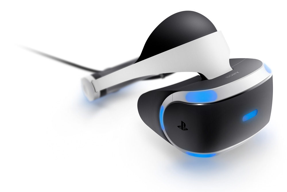
I won't go into the setup process too much, mainly because everything was set up when I got there.  For those who may not be in the know, the PS VR system requires the eponymous headset, a standard DualShock 4 controller, and the Playstation 4 Camera.  The headset itself was comfortable, though adjusting it could be cumbersome.  Once I was able to focus the lenses, it rested fairly snug on my head.  There was a bit of light coming through the top, but it turned out to be less distracting than I thought it would be.

Sound was provided by a set of earbuds, which I found a little disappointing, but I'm pleased to read that standard stereo headphones can be used with the PS VR headset.

As mentioned, I was handed a DualShock to control the game.  My first reaction was that this would break the suspension of disbelief, since at least part of the VR experience is navigating with sight.  Much to my delight, the folks at DICE took this into account.  I was able to highlight areas on the screen and then press the X button to interact with said object.

This showed me the potential of VR for something beyond flight simulators.  Imagine being on the ground for the Resistance, firing away at uncoordinated stormtroopers.  You battle your way through a vast hangar of assorted starships and decide to hop into an A-Wing and blast into open space.  This is an exciting proposition for future games (looking at you, Battlefront II), but I get ahead of myself.

Image result for star wars x wing vr

The initial boarding of the X-Wing happens against a white background with little else going on.  This is probably the best for someone like me, as it helps to acclimate the player to the navigation mechanics.

If you go back to the days of Tomb Raider on the original Playstation, Lara's movement was controlled by the D-Pad.  The dawn of the analog stick should've seemed obvious, considering joysticks were some the earliest arcade input devices players remember, but they are largely absent from early console software titles.  Nowadays, it'd be difficult for players to imagine controlling an avatar exclusively from the D-Pad.

It may sound rudimentary when talking about VR, but being able to turn my head to see something rather than press a button was a nothing short of magical.  This extends beyond simple navigation.  Once I took off in the X-Wing, I was moved along on proverbial "rails" while my squadmates chatted with the obligatory dialogue to set up our mission.  Again, this gave me a chance to lay off the stick and simply take in what was happening.

Being able to lean over and look over the side of the cockpit to see the walls of the ship and the great unknown of space stretching out around me is what made me sit up a little straighter and think, "There might be something to this."  If that wasn't enough, the real fun started when my squad engaged an enemy band of TIE fighters.

The controls for this worked much the same as they do for non-VR skirmishes, but being able to look to my left without turning my ship meant I could lock onto a target, begin firing, and begin thinking about my second target before the first had been extinguished.  This sounds subtle, but it makes a huge difference as to the perceived freedom you have as a player.  No longer am I controlling an avatar flying an X-Wing: I am the avatar.  Little touches like this are what completes the immersion, and I was fully, euphorically invested.

That's to say nothing of the jaw-dropping awe inspired by the arrival of a full-fledged Star Destroyer.  Aside from the sheer scale, I began the fight beneath the massive war machine, but had to circle up top to find the real action.  Creeping around the side of this iconic juggernaut to see the ship at large with my squad heavily engaged with enemy fighters finally gave me the thrill I'd been looking for since my first X-Wing Alliance battle: I was in a Star Wars movie.

I've played plenty of Star Wars games, from flight simulators to first-person shooters and third-person action games.  They were fun, but few could provide the genuine thrill of feeling like I was part of the action.  Say what you want about Battlefront's dubious lack of content; when I fired up the beta for the first time, I felt like finally somebody had gotten it right.  To see this authenticity carried over into virtual reality affirms my hope that this experience--and others like it--are not just fleeting fads in a hyperactive culture.  There's polish here.

The entire mission lasted about 15 minutes, and it is, perhaps, one of the lasting experiences of my life as a gamer.  In the same way that Tomb Raider opened the gateway to fully-realized 3D worlds, Battlefront's (albeit brief) demonstration of VR is a promise of things to come.

Should I Invest in VR?

Feeding off the high of my time as a rebel pilot, thoughts immediately turned to how I could get this experience in my own home.  It wasn't until a few hours later that the (non-virtual) reality brought me back down from the stars.

Firstly, VR isn't going anywhere.  If nothing else, it is becoming only more present in our entertainment.  Phones from Samsung and Google are packaged with VR headsets that supply a trimmed-down experience for those who are curious and budget-conscious.  Other phones are looking for ways to integrate Augmented Reality (AR) into their camera systems, as with Apple's rumored specs for the upcoming iPhone.

But for the average person, VR is still a few years away from being readily accessible.  Perhaps in another year, the hardware will be less prohibitively priced.  There's something to be said for accessories that cost more than the hardware they're designed to run on.

But even if I were to invest in the peripherals, there's the question of software.  As with any gaming platform, it's on worth the software available.  The X-Wing mission makes for a tremendous demo, but I imagine after messing with it for a few hours, I would grow tired of it and want something more.

Granted, I've not kept up with VR games as much as standard console titles, but I'm still waiting on that one experience: the one game that demands that I go out and get a VR headset ASAP.  Selfishly, I'm hoping Battlefront II steps in to fill that gap.  Realistically, we might have to wait a couple more years before developers have enough of a handle on the platform to start creating truly unique experiences that players can't ignore.

Which is fine, as I'll be saving up for that $500 PS VR bundle while we're waiting.

Monday, May 8, 2017

Microsoft Hits the Mark, But Misses the Target

Microsoft recently announced its brand new Surface Laptop, and it is beautiful.  Taking cues from the rest of the Surface line, as well as some of its rivals, the devices looks premium.  Aluminum finish, Alcantara cloth on its keyboard, and an invisible hinge to support that shiny Windows logo on the back, there's no doubt a lot of care was taken in the design.  But while the laptop does a lot right, it's probably not the device to shake up the education market.

Let's start with the obvious: Microsoft has two main competitors when it comes to this market--Apple and Google.  The latter in particular is winning the "edutech" sector by a landslide with devices that may feel compromised to techies but hit the sweet spot of performance and price for large institutions struggling to get computers into students' hands.

Apple on the other hand, hasn't been as successful when it comes to pushing iPads as learning tools en masse.  Lack of a physical keyboard, the limitations of iOS, and the fact that even the cheapest model iPad introduced earlier this year is still more expensive than the average Chromebook are all barriers Cuptertino has struggled with.  Where Apple has succeeded is with the higher education crowd: MacBooks are one of the most popular brands of laptop among college students, even as they face increasing competition from Dell, HP, and yes, Microsoft.

So is the Surface Laptop the device that finally gets Microsoft into an already fierce market?

We'll begin with what the Surface Laptop does right (and it does a lot right).

As mentioned before, there's the design.  For a device geared toward those most likely to abuse their machines while lugging them from class to class (and dorm to dorm), it's the first thing that hits you about these computers.  "Sleek", "sexy", and "shiny" are three words that spring to mind.  I'm not sure I've ever been a fan of the cloth keyboard (I'd much rather have a sturdy aluminum bezel), but that's a small point on an otherwise elegant look.

The attention to detail extends even beyond the exterior, as Microsoft has found a way to place the speakers under the keyboard proper, eliminating the need for speaker grills (something that maximizes the limited space of such a small PC), and allowing the sound to flow through the cloth to the user's ears.  It's not the lightest laptop on the market at 2.7 pounds, but it shouldn't put too much stress on what is likely an already full school bag.

Second in the win column is hardware.  Unlike Apple's ultra-thin MacBook--which uses the lower-powered mobile Intel processors (albeit with the added benefit of a fan-less design)--Microsoft's offerings come with the "latest" Core i5 and i7 CPUs.  It's safe to say they will offer a solid power boost as they are already touted to be up to 50% faster than the current model MacBook Air.  The devices are configurable with up to 1TB of SSD storage and 16GB RAM, though you'll have to step up to the significantly more expensive Surface Book if you want the extra horsepower of a dedicated GPU.

The screen is also similar to others in the Surface lineup, with the folks from Redmond claiming the pixel density equates this smaller machine to a 14" laptop as far as virtual workspace goes.

This is an all-around solid machine.  So what could possibly go wrong?

For starters, there's no USB-C port.  That may sound like a godsend to those who have thus far resisted the forward-momentum of the standard.  It's certainly a stark contrast to Apple's all-in stance on the port.  But for those who have already begun to use USB-C as their day-to-day port, its exclusion here only ensures that we have several years of awkward dongle-switching ahead, especially as more and more smartphones have adopted it as their charging port of choice.

In it's place are a standard-sized USB 3.0 port and mini DisplayPort.  I'm sure these were included in the interest of convenience, and not to please the bleeding-edge tech crowd.

Then there's Windows 10 S: the natural successor to the ill-fated Windows RT platform of the early Surface days--with one important change.  Much like its ancestor, Windows 10 S is designed to run only the apps available from the Windows Store.  This has the advantage of ensuring everything that's running on your PC has passed through Microsoft's (presumably) stringent seal of approval for maximum performance and security, but also nixes the ability to download programs from various websites; even the legitimate ones.

Unlike with Windows RT, where many users were incredulous at finding out the OS's restrictions only after they'd invested in the device, Microsoft is doing its best to make those limitations clear from the get-go.  It's also probably safe to assume that the applications students use most are not only available via the store, but in the case of the Office suite, are included in the price tag: a one-year subscription to Office 365 comes with every Surface Laptop.

And for those that still feel cheated by a "stripped-down" version of Windows, Microsoft will allow customers to upgrade to full-fledged Windows 10 Pro for an extra $50.  That's a pretty good deal if you absolutely need the flexibility of pure Windows, and it takes the Surface out of the niche category of being "for students" and throws it right into the crosshairs of the competition like Dell's XPS 13, HP's Spectre x360, and Apple's MacBook and MacBook Air line.

Yet even if you were to jump through all those hoops, there's still one more hurdle: price.

By the time I'd reached this point in writing the first draft of this post, Microsoft had launched its pre-order site for the Surface Laptop.  Given the specs and premium design, the results shouldn't be too surprising.  The base Core i5 model with a measly 4GB RAM and 128GB SSD storage starts at $999.  Prices continue to rise as you graduate all the way up to the i7 model with 16GB RAM and a 512GB SSD.  That last configuration clocks in at $2,199.  At that point you're entering the range of the Surface Book or even the MacBook Pro.  It's unfair to compare this machine to the MacBook Air (whose maximum configuration--Core i7, 8GB RAM, 512GB SSD--is just $1,549) as that model is still running Intel's 2015 chipset.

Whether it's due to our expectations or Microsoft's uncompromising design, it's clear this device will not serve as competition to the influx of Chromebooks in schools today.  During his presentation, Microsoft VP Panos Panay said many times that these devices were meant to last students from their first day of orientation to their graduation.  That's all well and good, but it leaves gradeschool students with Chromebooks as the substitute.

In that sense, Microsoft and Apple have jumped into the same boat.  College students already have plenty of options when it comes to laptops, and some are already using Chromebooks as their main devices.  Whether it's researching via Google, creating documents in Docs, or saving files to Google Drive, Chrome OS is a platform that feels more and more complete as wifi access becomes increasingly ubiquitous.

That being said, there's simply no compelling reason to buy from Microsoft unless you absolutely can't live without the Office suite or insist on owning the sexiest laptop money can buy.

Let's take Apple out of the equation and just look at other Windows laptops.  Sure, they may not look as pretty, but they run native Windows.  $50 is not a lot of money when you're spending thousands already, but it's yet another fee to use something that comes standard with other, less expensive laptops.

It's clear that the Surface line is meant to represent the "flagship" of Windows devices the way Google's Pixel line is mean to represent the very best of Chrome OS-based hardware.  The real star of the show is Windows 10 S, which is meant to inspire manufacturers to produce cheaper devices for Microsoft's "walled garden."  The Surface Laptop is not that device.

What's puzzling, however, is that the system requirements for Windows 10 S and full Windows 10 Pro are almost identical.  That's not to say Windows 10 is a demanding OS, but the Windows brand is not something casual users will associate with a Chrome OS caveat.  Until third-party manufacturers start churning out competitively priced machines to stand side-by-side with Chromebooks, it's going to be difficult to convince less educated Windows users to shell out a premium for a device running an operating system that handcuffs you out of the box.

The real danger, though, is that Microsoft is continuing to allow students at younger ages to grow up in a world that doesn't need Windows.  Even if the hardware is priced to match those of even the cheapest Chromebooks, it's going to become more and more difficult to convince people to shell out a $50 premium for a device that doesn't appear to do anything their Chromebooks don't.  You could argue that Microsoft has the ever-reassuring edge of compatibility on its side with most of the world still clinging to the Office suite, but you could also argue that the generation coming after us will do most of its work in a browser and we'll eventually become less and less reliable on file types and more dependent on simply having wifi access.

I'm sure Microsoft's got plenty of money to play with, so this isn't a make-or-break product launch.  This is simply growing the Surface brand, and it's an enticing entry for someone who is in the market for a solid, slinky laptop.

Unfortunately, Microsoft may too late to the party to fundamentally change the vibe.

Saturday, October 8, 2016

iPhone 7 Review: Struggling to Maintain the Apple Magic

Another year, another iPhone.  The familiar cycle is well-worn 9 years after the release of the original iPhone.  Touchscreens and smartphones have become the norm around the world.  The "magic" of portable devices and near ubiquitous access to your media is a luxury we largely take for granted.  So how does an iPhone that has hardly changed intend to change the game?

THE PHONE

I'll admit that if I hadn't broken the screen of my iPhone 6s just days before pre-orders for the iPhone 7 began (and the fact that Apple wanted to charge me an arm and a leg to repair it), I probably wouldn't have even bothered to upgrade.

The Look

Even now, if I set my iPhone 7 next to my iPhone 6s, it's easy to mistake one for the other.  Particularly from a top-down perspective, there's virtually no immediately visible difference between them.  In fact, when I first set up my iPhone 7, my iPhone 6s was sitting on the table and I found myself instinctively reaching for it when I would get a text or Facebook message before realizing I'd picked up the old phone.

The only glaring difference between the two is, of course, the lack of a headphone jack on the iPhone 7 (more on that in a bit).  In place of that port is a new set of speaker grills.  Otherwise, the design scheme is virtually identical to last year (and the year before).  It's a sore spot for some, but I can't complain.  While I still believe the iPhone 5s had the best pure design for any iPhone, I've had no problem adapting to the iPhone 6(s)'s size.

One problem I did have with my iPhone 6s was the visible antenna lines on the back of the phone.  Regardless of what color you chose, the antenna lines were a relative scar on Apple's traditionally elegant design.  That issue is non-existent here, especially if you opt for one of the two "black" iPhone models Apple is so fond of showcasing.  I grabbed a glossy Jet Black iPhone 7, and though it will likely spend 95% of the next year snug inside its case, a brief investigation did show that the antenna lines were practically invisible.  Aside from holding it inches from my face, the back of the iPhone otherwise appears as a single, glossy sheet.

It's always baffled me that people would fight for a particular color of iPhone, as almost every smartphone user I know has theirs inside some case or other.  The back of the phone (the part where the chosen color is most noticeable) is usually hidden.  So why would you wait an extra week for a Rose Gold iPhone when Silver and Gold were available right now?

Skeptic though I was, I became a victim of this very tactic with the iPhone 7.  I always loved the iPhone 4's smooth, glossy look and feel: it's the thing I missed most when I upgraded to the iPhone 5s' aluminum "Space Gray" back.  So when Apple unveiled the Jet Black iPhone 7, I was hooked.  I waited an extra week, even knowing the glossy finish would be especially vulnerable to fingerprints and--in Apple's words--"micro-abrasions".  This was the iPhone for me, and  I could not be more pleased with the look and feel of the Jet Black iPhone.

The New Home Button

Even if the colors don't get your tech-fire going, some of Apple's other changes will.

The new Home "button" is sure to get opinions flaring.  It's one of the first things I noticed when handling the new phone.  Much like the trackpad on Apple's 12" MacBook, the new Home button is a stationary piece of hardware that doesn't actually "click" in the traditional sense.  Instead, applying force to the Home button triggers Apple's "taptic" feedback that gives the illusion of the user having clicked something.  Apple even allows you to customize what kind of feedback you receive from the Home button so that it feels just right for each user.

It took some getting used to, but by the end of the second day I barely noticed the new Home button at all.  In fact, picking up the 6s and clicking an actual button now feels a bit awkward.  Of course, the level of comfort will largely depend on the person using the phone, but I'd venture to say most people will not have an issue with it.

Apple is now touting the new phone as water resistant, and several tests have shown it to be very true.  While you still shouldn't seek out opportunities to submerge your iPhone, you won't be freaking out if it happens to be in your pocket when your cousin pushes you in the pool.  I haven't tested this myself as I don't have the luxury of a "dummy" model to fall back on, but there are plenty of YouTubers out there with their own demonstrations.  The phone holds up surprisingly well, even beyond Apple's promised depth.

Saying Goodbye to the Headphone Jack

Finally, there's the matter of the Lightning Port and--more specifically--the matter of not having a 3.5mm headphone jack.  This is probably the most controversial decision Apple has made with the new iPhone, but I'm not sure the controversy is warranted.

If, like me, your iPhone is your primary listening device, you're stuck in two camps:

Camp A - You have a premium set of headphones that you use when listening to your iPhone.

Camp B - You use Apple's boxed-in EarPods when listening.

Either way, Apple's got you covered.

If you use a pair of premium headphones (I have a pair of Beats Studios), Apple provides a Lightning-to-3.5mm adapter.  It's a tiny thing: so small that Apple managed to pack it in on the opposite side of its earphones in the box, and--as the name implies--it allows you to attach a pair of legacy headphones to the iPhone via the Lightning port.  Just beware: this thing is very tiny and you will probably end up losing it at some point.  Not to fear: Apple is selling replacements for an easy $9, which is rather generous by Apple standards.

If you're in Camp B, Apple--as ever--includes their stock EarPods in the box; only this year you'll find the cable tipped with a Lightning connector instead of the "antiquated" 3.5mm audio tip.  (Apple is selling these independently as well, for $29.)

There is a third, growing camp: those that use wireless headphones.  While Apple is yet to release their own wireless AirPods using the new W1 chip that promises easier pairing over standard Bluetooth, third-party manufacturers have plenty to offer in the way of wireless listening.  If you have a pair of wireless headphones that you've been using with your old iPhone, these will work just fine with the iPhone 7.

So, out of the box, you should have no trouble listening to your media with the new iPhone.

That said, it didn't take long for some to start asking Apple the kinds of questions Apple doesn't like to hear:

How do you listen to music while charging your iPhone if there's only one Lightning Port?

At first this felt a little nit-picky, but the more I thought about it, the more I realized this could be a glaring problem for many.  How many people sit at their desks at work with their iPhone playing music while they listen through their headphones?  How many people go on runs with their iPhones and bring external batteries to keep it charged?

Obviously, Apple would love people to believe that the extra battery life afforded in the new iPhones (an extra 2 hours in the 7 and 1 hour in the 7 Plus) means you shouldn't need to charge your iPhone in the middle of the day.  Even now, with my iPhone off the charger for 8 1/2 hours or so, it sits happily at 54%.  That's with a fair amount of web surfing, texting, games, and audio streaming.  Nothing too intense, but this is my typical day with iPhone, so I'm happy to see that it's holding up better than the 6s.

Apple's VP of Worldwide Marketing, Phil Schiller, gave two very Apple-esque answers to the charging crisis:

1.)  You should invest in a pair of wireless earphones like Apple's own AirPods.  Because after buying a $650 phone, who doesn't have an extra $160 for a pair of wireless earphones?  

2.)  You should buy Apple's Lightning Dock: the standard charging dock for iPhone that features a 3.5mm audio output jack.  That will set you back a measly $50.

Of course, neither of these answers are satisfactory.  What's more, they make the removal of the headphone jack (something Apple most likely did for water-proofing purposes) feel like nothing more than a cheap marketing tactic to move its own accessories.  While it may not be an entirely innocent play by Apple, the magic in Cupertino has always hinged on the idea that the company is doing what's best for you, and that is very hard to buy into when its only answer to the friction of adapting is, "buy more products."

So, as someone who takes their iPhone everywhere and uses it as their primary computer, communication device, and media player, how inconvenient is it not having a headphone jack?

To be honest, not especially.

Thus far, I can think of only one instance where I grabbed my iPhone, intending to listen to music, and pushed it aside in favor of my iPad because I didn't want to go grab the headphone adapter.  I also listen to audiobooks, and while I generally put headphones on for this as well, I simply turned up the volume on my iPhone and set it on the counter while I did the dishes.  I've since kept the adapter attached to my headphones, which I always put back in their case when not actively listening, to eliminate the extra step in the future.

I could discern no noticeable difference when listening to music with the Lightning connector as when listening without it, but my ears may not be as sensitive to the sound as others.

Sight and Sound

As for the built-in iPhone speakers, there are two of them, now.  The earpiece in the iPhone now doubles as a second speaker and it fully supports stereo separation when the phone is in landscape mode.  What's surprising is that I found the earpiece speaker to sound slightly better than the bottom speaker on the iPhone.  Granted, my only test for this was holding my ear up to first one speaker, then the other, but I'm still surprised that the top speaker sounds noticeably better.

Not much else has changed, but I will make one final point about the iPhone 7, and that's the Optical Image Stabilization in the new camera.  This was a feature previously reserved for the bulkier iPhone 7 Plus, but Apple graciously included it with the standard 4.7" iPhone this year.  Now, I'll be the first to admit that while my iPhone has become my primary camera over the years, I don't usually shoot a lot of video with it. That said, a side-by-side video test of the iPhone 6s and iPhone 7 shows a dramatic difference when filming shaky video.  I took both phones and shot the same images while shaking my hands up and down simultaneously.  Playback proved that the iPhone 7 was much better at compensating for camera movement, and while you could definitely tell neither video was filmed with a steady hand, it did a much better job of maintaining clarity.  This is a great feature, and I'm glad Apple's including it in all iPhone models this year.

That being said, yes, I am somewhat jealous of the iPhone 7 Plus' second lens and all the salivating features that come with it, but i just can't bring myself to use a 5.5" phone.  Maybe one day the 4.7" model will get some love in that department as well.

Overall, I'd have to say that the iPhone 7 is a great smartphone, but I'm not sure any one feature--or even all of these features, collectively--are enough to warrant an upgrade if you own anything newer than an iPhone 5s.  Much of Apple's improvements come via iOS 10, which is available to any model all the way back to the iPhone 5, so give that a whirl first.  If you're part of the iPhone Upgrade Program or a similar program through your carrier, upgrading is a no-brainer, but if you're holding out for something more radical, you may want to wait and see what Apple does in 2017 for the iPhone's 10th anniversary.

THE EXPERIENCE

I've been fairly easy on the iPhone 7, and that largely has to do with the fact that nothing has drastically changed.

However, I do want to touch on some of the factors surrounding the iPhone "experience".  This has less to do with the iPhone itself and more to do with the process of migrating from my iPhone 6s to my iPhone 7.

A device is one thing.  The "experience" of a device is another.  The latter is something Apple prides itself on, going back to when Steve Jobs would argue over the packaging design for his products.  Those aspects are common with most manufacturers now, but Apple is still the flag-bearer.  Once the phone is out of the box, there's the process of setting the device up and getting everything moved over from one device to the next.

To say that Apple needs to refine this latter process is something of an understatement.

Unboxing

Once I got my iPhone 7 home, I plugged in my iPhone 6s and began the methodical process of backing up the device.  Not wanting to rely on my internet connection for backing up and restoring, I instead opted to make a backup to iTunes on my iMac.

This process took about 10 minutes, during which I had a chance to unbox the iPhone 7.
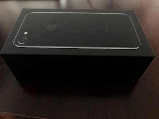
The first thing I noticed about the iPhone packaging is that it was black.  That may not sound like a big deal, but there hasn't been a black iPhone box since the 3GS back in 2009.  I've always opted for the black finish for my iPhone, but they've always arrived in white boxes.  This year, Apple is changing things up.  If you order a black iPhone, you'll get a black box.  A nice touch that again affirmed my choice in color scheme.

Unlike my previous experiences with Apple products, the first thing facing me out of the box was not the phone itself, but the cardboard sleeve housing the very brief (and very minutely-printed) documentation.  Under this was the iPhone itself, and under that was the usually kit: the EarPods, 5W power brick, Lightning Cable, and (new to the group) the Lightning-to-3.5mm adapter.  Nothing too surprising, really, except that I have to question Apple's decision to put the documentation on top of the iPhone.  While seeing the words "Designed by Apple in California" are a nice prelude to the device itself, it does take away a little of the "ahh" factor when the device isn't there to greet you upon opening the box.

Backup

I fired up the iPhone, and there was the familiar white Apple logo glowing up from its black obelisk.  Then came the blinding white of the setup process screen.  I clicked through all the prompts until I got to the point where I could restore the phone from a backup.

It was here that I had to play the waiting game, and it's here that I believe Apple has some work to do.

The first thing I did was look down at my wrist.  It was 7:00 p.m.  I could have this setup before bed (I'd even get a chance to play with it a little).  But it was my wrist that gave me pause.

How exactly did I go about unpairing my Apple Watch?

For the answer, I was forced to turn to Apple's website.

It baffles me that when setting up a new iPhone, there is not a single slide that asks whether you own an Apple Watch and would like to unpair it from your existing iPhone before proceeding.  I understand that smartwatches in general are still considered a niche product, but this is an easy way for Apple to plant the seed in consumers' heads, and make the lives of those already own an Apple Watch a little easier.

Regardless, Apple's support documentation explains that there's an "unpair" option in the Apple Watch app on the phone.  Great.

But would all my Activity data be saved?  All my settings?  My Watch faces and my preferences?  To answer these questions, I had to reference yet another support document on Apple's website.

It turns out the Apple Watch backs up to the iPhone it's paired with.  The iPhone performs a backup of the Apple Watch when the devices are unpaired,  and all that data is backed up when you backup the phone.  This sounds great, in theory, except for the small piece of fine print stating that if you do not perform an encrypted backup in iTunes, your Activity data will not be saved.
I looked in iTunes.  "Encrypted backup" was not checked.  So, once my iPhone completed the backup (another minute or so), I unpaired my Apple Watch (which took several minutes to perform the backup and complete the process of unpairing), and then had to backup my iPhone yet again to iTunes.  We were now going on 7:30 p.m.

Restoring From Backup

Once the iPhone 6s had been backed up, I connected my iPhone 7 and chose the option to "Restore from iTunes Backup", selecting the backup I had just performed.  It was another ten minutes or so before I was able to interact with the iPhone again.  At this point, it asked me the standard setup questions: Select a wifi network, log in to iCloud, etc.  These are all very obvious questions, but some of the things I was asked to do surprised me.

I was directed to setup TouchID and Siri again.  I realize this probably has a lot to do with Apple's tight stance on consumer privacy (your fingerprints never leave the encrypted chip on that particular iPhone), but it seemed on that even in an encrypted backup to an encrypted and password-protected computer, no reference to this information was stored.

I was then asked what sort of feedback I preferred for the new Home button, and after a few more prompts, was taken to the Home screen.

Now, I will admit that it has been quite a while since I've backed up an iPhone to iTunes, but back in the day, doing so meant that a hard copy of each app was stored on the computer and that those copies were transferred via the Lightning cable to the phone again upon restoration.

No longer.  Upon reaching the Home Screen, I discovered that most of my apps were in the process of being downloaded from the App Store.  Little crescent circles gradually filled at what felt like a snail's pace as each app in turn was fetched from the Internet and deposited to the phone.  Why this isn't done via the computer and Lightning cable, I have no idea.

Glancing at my iPhone right now, I see that I have 122 apps on the phone.  Not all of them are dire.  I could probably stand to delete a few, but I have plenty of space free, so it's not an issue yet.  What is an issue is 122 apps downloading on my modest 30Mbps internet connection.  There was little I could do but sit and watch as those circles slowly closed: a sensation that was oddly satisfying and frustrating at the same time.  Luckily, most of these apps remembered my preferences once they were re-installed, and entering my passwords again was rarely needed.

Then came the most important part: my music.

To say that Apple has made a mess of iCloud Music Libraries is an understatement.  People have wound up turning the feature completely off because it seems intent on wreaking havoc.  While I've been frustrated by it, and had to restore my music from scratch in several instances, I've had little problem with music as a whole, though I still keep a non-iCloud copy of my iTunes library on my MacBook Pro, just in case.

When I opened up the Music app, I was surprised to see nothing there.  Once again, I imagined that Apple intended to download all the music from scratch from iCloud.  But there were tracks in my iTunes library that I knew would not exist in iCloud.  So once again, I turned off iCloud Music Library and plugged the iPhone into my iMac where it proceeded to sync over 7500 songs.

Final Setup

By the time this was all complete, it was nearing 9:30.  It baffles me that this entire process is not more intuitive or seamless, particularly for a company like Apple that prides itself on the user experience.  Yes, Apple's cloud-based enterprises have a lot of growing up to do (they still only offer a pathetic 5GB of free iCloud storage), but if you're banking on users storing their backups, data, and media in your cloud, then you better make it easy to retrieve that data and transfer it to a new device.

Moreover, I understand that all of this takes time, and that time will vary depending on the user's internet connection.  But I would much rather have dealt with a slow-moving progress bar beneath an optimistic Apple logo then have to sit there and watch each app load in turn or each track sync individually.  Why tease me with the idea that the phone is ready to use only to have me find it is still working to get where it needs to be?

To make matters worse, I still had to pair my Apple Watch with the new iPhone.  This was another laborious process that took much longer than it should have (about half an hour).  Once again, there's no point in the iPhone setup process that prompts you to pair your watch.  Luckily, once it was done, all my data appeared to be intact.

The same is true of Photos.  Again, this is a feature I have enabled in the cloud so that all my photos appear on all my connected devices.  That sounds great in principle, but it's far from perfect.  When I looked at my iPhone 6s, I had 2,941 photos.  When I looked at my iPhone 7, I had just 2,031 photos.  Why?  I still don't know.  I'm assuming it took time to retrieve all those photos from iCloud, but it wasn't until the next day that the number of photos on each device were identical.

And as for the Photos app, Apple includes a facial-recognition feature in iOS 10 that allows users to easily find pictures of their favorite people.  That's all well and good, except that the only time the iPhone will scan your photo library is when it's plugged in to power and locked.  To make matters more cumbersome, the technology behind it seems to still be in beta form as the next day my face was presented as belonging to five different people.  Luckily, there is an option to "merge" these instances together to let the phone know you are the same person, but even today--over two weeks after setting up the phone--I will occasionally wake up to see that it has created yet another instance of me.

Room For Improvement

iOS 10 is a very nice improvement overall.  It feels zippier than its predecessor and more refined, but before you can enjoy any of that you must wade through the labyrinthine bog that is the Apple setup process.

You see, none of these things are terribly difficult in and of themselves.  Syncing music can be time-consuming for someone with a big library, but it's not hard if you set aside the time.  Setting up Apple Watch isn't nearly as frustrating if you're doing it for the first time.  Backing up and restoring from iTunes or iCloud is not a particularly tricky process.  But when you combine each of these into a single, monotonous task, it becomes a mind-numbing marathon as you must jump first one hurdle, then another in your quest to simply get a smartphone up and running.

It speaks volumes that the iPhone has become such a centerpiece to Apple's ecosystem.  I'm a perfect example of someone who has "bought in" and invested heavily in that system.  But there is an inherent flaw here.  Apple prides itself on developing its hardware and software in tandem to provide the most seamless user experiences for their consumers.  But when you tack on features years after the fact, it starts to poke at the seams of that "magic".

iTunes is a prime example of a product that is overblown.  A simple music buying, syncing, and playback app became an all-in-one media hub for everything from music to movies to TV shows to apps and radio.  There's no way Apple could make it truly useful again without rebuilding it from the ground up.  While the latest redesign in macOS Sierra has gone a long way in making that program useable again, it's still not intuitive enough to feel reliable.  Moreover, why are we still relying on "desktop-based" programs like iTunes to hold our media in 2016?

I know there are other solutions out there, but the point is, Apple should be the solution: Apple should recognize the need for a revamped media app and create that app for its users.  Apple shouldn't just be presenting iCloud services (something that started with music and branched out to Photos and iDevice backups), it should be actively working to present the most elegant solution available.

Accessories

But it's not all doom and gloom for Apple this year.  I have at least a few positive notes for the folks in Cupertino.

The first is that Lightning to headphone adapter.  I know this is a sore spot for a lot of people, but Apple did right by its customers.  Say what you want about the company's rhetoric in removing the headphone jack: they could've left the adapter out of the box, or worse, they could be charging $20 for that adapter instead of $9.  I applaud Apple for both including the adapter and making the purchase of future adapters a painless affair.

Second is the new Apple Leather Case for iPhone.  I've always liked Apple's cases for their slimness and style.  I had an Otterbox back in the day with my iPhone 4, but since then I've preferred simpler cases that don't add too much bulk to the phone itself.  That's become especially true as the phones have gotten narrower (at least in depth).  So for the iPhone 5s and iPhone 6s, I opted for Apple's homegrown leather cases.
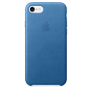
Unfortunately, in the instance of the 6s, it was not always a fond experience.  With the redesign of the iPhone 6, the volume buttons shrank and the Sleep/Wake button was moved to the side rather than on top.  Those buttons were wide and flat on previous iPhones, but were narrow and finicky on the iPhone 6 and later.  On the leather cases for the iPhone 6s, at least, the housing for those buttons was not particularly forgiving and I often found myself unsure if I'd pressed firmly enough to trigger a reaction from the phone.  Even now, picking up the old case, it's amazing how stiff those buttons are to the touch.

That's changed with the cases for iPhone 7 as Apple has instead molded the button housing out of aluminum.  There's much more feedback to the buttons, now, and I've had no problems clicking away.

Finally, there is iOS 10.  I'm not thrilled with everything Apple has done in the new iOS.  The Messages app, in particular, is starting to feel bloated and clunky.  But there is a sense of refinement to iOS 10 permeated its predecessors and promises that Apple still knows how to do things right when it wants to.

The glaring counter to that seems to be that there is a growing disparagement between hardware and software development.  While the software continues to be more cohesive and seamless, the hardware feels a bit stagnant.  Sticking with the same design three years running is a first for Apple, and one can only hope that the iPhone's 10th anniversary will bring something truly revolutionary to the table.

It's also time to stop and ask ourselves what we expect from a smartphone.  How many new features can a company like Apple, Samsung or Motorola continue to pack into a pocket-sized computer before we stop looking for the next "revolutionary" smartphone?  Faster processors, better cameras, increased storage, and longer battery life are all great things, but none of theme fundamentally change the way we use our phones.

It's never been easier to upgrade to a new smartphone.  All the major carriers and even Apple itself offer programs for customers to upgrade annually to the latest and greatest device.  To any early smartphone adopter that sounds like a dream come true, but for many the "magic" of mobile technology is wearing thinner by the month, and it won't be long until we are looking to companies like Apple for the "next big thing."
Tuesday, June 28, 2016

Why Neo and Scorpio WON'T be the Worst Thing Ever


In 2005, I wanted an Xbox 360.  Everyone wanted one.  But, like so much of new tech, there were massive supply shortages and at $400, the initial price tag was just too high to simply "dive in".  Plus, I still had some great games like God of War II and Shadow of the Colossus that I'd yet to finish on my reliable, old Playstation 2.  The more I played them, the more I realized I wasn't a Microsoft guy.  I was a Sony fanboy.  Yes, Microsoft had some great exclusives like Left 4 Dead, Gears of War, and Mass Effect, but I was content to wait until Sony released their console.  (Sorry, guys, give me Quake II or Unreal Tournament over Halo, any day.)

This was also when the HD Format Wars were shaking out, and while Microsoft had fastened its "next-gen" console with a standard DVD player and an expensive add-on, Sony was going all out by fitting its shiny new living room invader with the barely-emerging Blu-Ray player, which promised higher storage capacities that fostered better video quality.  Yes, it was more expensive than the competition, but the Playstation 3 offered a more "complete" console with HDMI ports, an integrated wireless adapter, a native wireless controller, and damn it looked sleek as hell.

Unfortunately, by then, Microsoft had been entrenching itself into homes for almost a full year, and Sony would have a rough go of catching up when the 80GB version of its console was retailing for $600.  And even if you concede that Sony lost the fight for the last console generation, the allegiances pledged and forsaken during this time would define it for years to come.

Buying a console is a hallmark of a new gaming cycle.  Think of it like Christmas, if Christmas came once every seven years or so.  A console wasn't just a toy or some piece of equipment for your entertainment center like a new DVD player that could be swapped out for $50 year-on-year.  A console was an investment.  Whatever you connected to your television in those early days would likely remain connected for the next decade.  The weight of that decision can overwhelm the casual gamer who is coming from outside the hype, and could start wars of rage among those who have already been indoctrinated into the ultra-competitive gamer culture.

I eventually caved a year or so later and got an Xbox 360 anyway, and while I got exponentially more frequent and consistent use out of my Playstation 3, playing the Mass Effect series on my 360 was worth the price of the console alone.

With my loyalties firmly behind Sony, I was all too eager for them to give me an excuse to upgrade to the Playstation 4.  That excuse came in the form on Uncharted 4, and it did not disappoint.  With a lower retail price and beefier specs than the Xbox One, it seemed obvious which console to buy, especially after Microsoft blundered its way through the initial unveiling of their new baby.

Once again, I felt assured that the console I bought back in February would be decorating my entertainment center for the next ten years or so.  As a gamer, I was content.

Then it all came crashing down at E3 2016, when Microsoft announced their mysterious Project Scorpio and Sony confirmed longstanding rumors that they'd been brewing an early successor to the PS4.  Both consoles promised more power, but each company assured its customers that these consoles would not only be backwards-compatible with the existing catalog of current-generation games, but that all games going forward would be available for both the existing consoles and the consoles to come.

That should have been enough to assuage my anger, but I've heard similar promises before.  Anyone who's played MLB: The Show on a Playstation 2 when they could be playing a much smoother, better looking version on Playstation 3 can tell you that the promise of ubiquity among games is not as reassuring as it may at first appear.

What were these guys thinking?  It's not like the Xbox One and Playstation 4 have grown long in the tooth!  They still average $300-$350 a pop!  That's a far cry from the $100 Xbox 360's or Playstation 3's you can get these days!  Why would they even bother introducing new hardware when this console generation is just starting to hit its stride?

Well, to be honest, there's a few reasons.

Firstly, there's the adoption of 4K.  Whereas Ultra-High Definition seemed like an expensive luxury a few years ago, 4K TVs are finally reaching the price point that makes them attractive to those that couldn't previously afford them.  With companies like Netflix and Amazon pledging to produce content in 4K resolution, the real boom for the format will happen when broadcast television makes the switch (which is a huge can of worms for a whole other article).  Say what you want about the lack of 4K content (which is keeping me from splurging on a new screen of my own), but those looking for the crispest video experience are expected to be flocking to 4K in 2016.

Unfortunately, one thing you won't be able to do in 4K is play video games.  As powerful as the latest crop of hardware is, it's barely powerful enough to push 1080p at 60 frames per second.  Try quadrupling that resolution, and you'll be lucky to see anything resembling a playable experience.

The upcoming Xbox One S may be able to play 4K video, but if Microsoft has its way, it looks like Scorpio is groomed for 4K gaming.

The next elephant in the room is Virtual Reality games, which were prominently featured at E3 this year.  Like 4K games, the Xbox One and Playstation 4 are nowhere near powerful enough to present a smooth VR experience; and when it comes to VR, smoothness is everything.


So while Microsoft didn't announce their own VR hardware, Sony went ahead and put a price tag on theirs, and while Sony promises that existing PS4's will in fact be able to use the upcoming Playstation VR headsets, it's unknown if the system has the "oomf!" needed to render two instances of 1080p video at a constant 60-90 frames per second.

That's all well and good, but I was still brimming with frustration.  I'm not what most people would consider a "hardcore" gamer.  Sure, I enjoy video games.  A lot of video games.  And yeah, I like to pimp out my PC to make it the best it can possibly be.  I love beautiful games, and I love them at smooth framerates.  Did Uncharted 4 start to stutter a little bit towards the end when things got hot and heavy?  Sure, but the game itself was never unplayable.  In fact, aside from one instance in which the game froze toward the end of what had been a rage-inducing firefight, not only did the game look incredible, but I never noticed a perceptible dip in performance until the very end.


It's not a question of whether or not I'd like a console that could play Uncharted 4 with no hiccups whatsoever.  It's the question of whether or not I'm willing to pay for a new console, effectively replacing my less-than-a-year-old one, for that privilege.

I also have to ask myself how quickly I'll be dipping in to the world of VR, and whether the current crop of promised experiences is worth the investment in a headset that in and of itself costs as much (if not more) than any console required to use it.

For me, the answer is no.  Not only can I not afford this upgrade, but there's simply no motivation for me to upgrade right now.  However, coming to that realization helped me understand that I was looking at this all wrong.

As a PC gamer, I'm used to new hardware coming out on a more-or-less annual basis.  When it does, I have to weigh the pros and cons (mostly financial ones) to see if the investment in new hardware is really worth the performance boost.  Most times, the answer is no.

But I'm also a console gamer, and the console gamer in me is used to investing in one machine over seven or so years before needing to drop another $400-$500 on a new one.

See, the language of these industries is different.  PC language says, "If you can afford it, we have it," whereas console language used to be a one-stop-shop for a system that "just works."  New PC hardware meant that elitists could upgrade to the latest and greatest, but new console hardware meant that the industry expected you to upgrade to whatever they were selling if you even wanted to be relevant in the next year.

Then I took a look at my phone.  There's a notification from AT&T that I am eligible for an upgrade.  But I'm staring at my iPhone 6s thinking to myself, "Apple hasn't even come out with a new flagship phone for me to upgrade to!  And even if they did, there's no reason for me to upgrade this phone!  It works fine!"

That's the way we will start thinking about consoles: Sure, there's something better out there right now for those who can afford the upgrade, but mine's working just fine for now.

The difference is, whereas not upgrading from a Playstation 2 to a Playstation 3 meant you couldn't play God of War III, not upgrading from a PS4 to a Playstation Neo doesn't shut you out.  You'll still be able to play all the games that are coming out for this console generation.  Will they look quite as pretty or play quite as smoothly on your current hardware as they will on the new one?  Probably not.  And if that bothers you enough to sink more money into a Neo or a Scorpio, then the option is there.

But for someone like me, who can't afford to upgrade their console or their phone every two years, the promise is that I'm still part of this console generation.  I'm not being left behind.

Now, obviously at some point they will phase out the Playstation 4.  More and more games will become exclusive to the consoles with the hardware capable of presenting them as their creators intended, and then gamers will have to choose whether or not to upgrade.

Hopefully that day is a good five or six years from now.  By then, something newer than Scorpio or Neo will be on the market, and VR will be cheaper than $400.

By then, the idea of having a choice will be more liberating and less intimidating, and we as a gaming culture will be looking at upgrade cylces as a freedom of choice rather than a requirement.

Wednesday, June 15, 2016

WWDC 2016: A Reboot for Apple


Apple's annual summer developers conference was met with mixed reviews by their adoring faithful, but it marked a much-needed return to form for the "magic" the folks in Cupertino are known for.  With a complete omission of hardware-based hype (no new iPhones, Macs, or iPads), the focus was solely on improving the "Apple experience" across every existing platform, and that is something the company desperately needed.

Just over a week ago, I proposed that Apple's muddled design language has been a sore spot for consumers even as its hardware continued to evolve (albeit at an incremental rate).  Using iTunes as the primary example, interacting with the same content across iOS, OS X, tvOS, watchOS, and even Windows is drastically, frustratingly different.  At this year's Worldwide Developers Confernce, Apple seemed determined to rectify that by not only introducing new features to each of these platforms, but redesigning the interfaces to provide a more cohesive user experience across devices.  Is it perfect?  No.  Will it solve all the problems plaguing the Apple ecosystem?  Probably not.  But it is a welcome step in a more proactive direction.  Rather than bury its head in the sand with some hyperbole about the inherent "magic" of simplicity, Apple is working hard to bring that magic back to the fore, and it showed.

In some ways, this was Apple's most Apple-like press conference in years.  Here are some of the reasons why.

Craig Federighi

As the CEO of Apple, it's Tim Cook's obligation to open and close the show.  But to say he lacks the instant charisma and presence of Steve Jobs is an understatement.  Despite getting a hearty round of applause upon gracing the stage, Cook lacks the understated "cool" factor that Jobs radiated when he was at his best.

There's nothing wrong with Tim Cook.  He's done a fine job as CEO, particularly in a time where Apple is under tremendous scrutiny by its shareholders and the government, and under immense pressure from competition like Microsoft, Google, and Amazon.  As a presenter, though, Cook feels less like a rock star and more like the boss showing up to the company picnic.  "Hi, everyone.  I'm here.  I'm in charge."

When Cook starts spouting numbers, it's with the sort of boardroom finesse of a seasoned business executive instead of the enthusiasm of someone drinking the Apple Kool-Aid.  This may seem nit-picky, but the truth is that Apple's success has less to do with "groundbreaking" products and more to do with the culture and mystique surrounding the company as a whole.  As an audience, we may love our Macbooks and iPhones, but that enthusiasm wanes after just a year of using them.  Already my iPhone 6s feels standard rather than "premium."  My 3 year-old Macbook Pro is starting to lose its luster in light of thinner, lighter, sleeker machines (even if they're grossly under-powered).  Apple's job isn't just to sell us new products and services every year, it's to re-ignite that "Reality-Distortion Field" Jobs was so famous for: pulling us back into the aura of Apple where everything is "magical" and every new product is a revelation.

Cook is not the man for that.  He does a fine job talking about Android to iOS migration, Apple's green energy initiatives, or educating the next generation of programmers, but he's not the man to be touting the "magical" new products or services we're there to see.

That's where Craig Federighi comes in.

Now, don't get me wrong.  Just watching this iOS 7 reveal video featuring Craig makes me think this guy's been brainwashed by some Apple voodoo shaman, but listen to the difference in tone from when Cook is on stage talking numbers to when Craig is on stage talking about embedding Siri into macOS.

Federighi has what Cook needs: the ability to sound truly passionate about what he's showing you.  Was anything at WWDC truly revolutionary?  No.  But I'm excited about it because Federighi made me believe these were features I not only wanted, but couldn't wait to have!  Even with hiccups in the on-stage demo and a clear fetish for emoji, the promise of more responsive apps in watchOS and a redesigned iOS Music app give me hope that my experience with the products I use every day is only going to get better.

In contrast, Apple should be keeping Eddie Cue off stage when at all possible.  Cue may be Apple royalty and a genius behind the scenes, but he was not meant to be on camera in front of a live audience.  He swaggers onto the stage in "casual" dress and a smile that's a little too happy to be there.  Whether intentional or not, it's an example of how the Apple hubris can harm when too prominently displayed.  Remember: we're attempting to distort reality, here, and Cue takes me right out of it and reminds me that this is nothing but a product demonstration by a tech company.  Cue seemed caught between being over-rehearsed, and not having rehearsed enough.  Doing his best to sound excited, he often stumbled over key parts of his presentation, always looking down at the teleprompter even as the products he talked about flashed on the screen behind him.

On the flip side, Federighi comes across like a kid in a candy store dressed like a professional adult.  His smile is the kind that's not just happy to be there, but excited to show you what he has for you. That excitement permeates the room and the audience.  When he speaks, it's deliberate but never forceful.  It's the tone someone uses when they don't want to openly disagree with you, but will give you just the right information to make you question your outlook.  He's not forcing a product in your face, he's inviting you into his world, and whether your mind realizes that or not, it makes a huge difference not just in our perception of him, but our perception of the products he's displaying.

Even moreso than Sir Jonathan Ive, Federighi carries with him a vestige of Steve Jobs: the power to change our minds, and the childlike wonder that still manages somehow to be in awe of itself.  That's where the Apple "magic" comes from, and it's very reassuring to see its return.

No Gadgets

Even if you're familiar with Apple's retail schedule and knew we wouldn't see a new iPhone until the Fall, you were probably expecting some sort of hardware unveiling at WWDC.  Rumors are still circulating about a refreshed Thunderbolt Display, an Apple Watch 2, and a refreshed Macbook line with current-gen processors and even OLED touchbars.  You probably hoped one of these would show up at WWDC.  None did.

That's a sore point for many Apple fans who get their jollies out of upgrading to the absolute latest and greatest every year, but the lack of gadgets at WWDC made one thing crystal clear to everyone watching and attending the conference:

Apple is committed to its software development community.

Obvious, right?  (Tt is a developers conference, after all!)  However, the long-reaching effects of this message may not be immediately clear.

This may seem rudimentary to the way mobile software is distributed, but we often don't take into account how developers get their software to us.

A great example is the idea of the "free app."  I know plenty of friends who simply refuse to pay for an app.  They'll use the ad-infested free version if it means they don't have to pull out their credit card.  There's something to be said for frugality, but most people don't even recall that on the other end of that app is a developer that sank time, money, and resources into getting it to you.  That $1.99 may seem like a lot, but when you consider that Apple takes a 30% cut of every app purchased, suddenly your $1.99 becomes less than $1.40.  A cup of coffee costs more than that.

It's not just Apple doing this.  Virtually every mobile app store follows the model established by iOS.

Developers often feel powerlessly beholden to this business model, since there's no other way for them to get their software on the device aside from asking users to jailbreak their phones.  They're expected to just "suck it up".  It may not be a big deal for a game like Angry Birds, which has been downloaded millions of times across multiple platforms, but it is a big deal for the small studio putting out an app or a game for the first time.  Not only is it difficult to get people to pay for an app from an un-established company, but doing so then means that Apple is still entitled to 1/3 of the revenue just for hosting the app in their store.

Conversely, the App Store in OS X is at a crossroads as well.  The difference here is that developers have a work-around: rather than hosting their software through Apple's App Store, they can just direct users to download their software directly from their own website.  If I want a copy of, say, Scrivener, I can download it directly from the App Store, or I can go to Scrivener's website and download it there.  The latter bypasses Apple completely and ensures that the money I fork over for the software goes directly into the developers' pockets.

Apple is all-too aware of this, and has decided to rethink its model.  Soon, Apple will take just 15% of app purchases, effectively cutting its share in half and ensuring that developers receive up to 85% of the money paid for their software.

That sounds generous by Apple, and it is.  It's very possible Apple will see a significant drop in App Store revenue because of this, and that's a risky situation considering shareholders like to pay attention to things like revenue streams.  What choice does Apple have?  They could simply keep the existing model and force developers to eat the cost of doing business with them.  But that's not exactly prudent on Apple's part.

Why not?  Because any anti-Apple zealot will tell you, Android is the most widely used mobile OS in the world.  Now, we can get into the minutiae of the plethora of devices Android runs on (everything from $50 phones to $1,000 tablets), but the truth is that while iOS may be perceived as the standard-bearer for mobile computing, Android is the system more people see every day.  It's the Windows 95 to iOS's Mac OS.  It may not be as flashy, but it's flexible, customizeable, and growing more capable every day.

Apple can still pull the "But we're Apple," card, but if we're talking sheer numbers, developers who want to get their apps on the most devices develop it for Android.

By cutting their revenue in half, Apple is practically begging developers to keep iOS at the forefront of their development cycle, and that's very good for developers and users alike.  It ensures that developers get the exposure they want on all platforms without the penalty of loss of revenue, and it ensure that iOS users get the best and widest selection of apps available.

A Better Experience

There was another message sent by Apple on Monday, and while it's a positive one, it's distinctly un-Apple-like.

Contrary to what they might have you believe, Apple is very much aware that its software isn't perfect and is committed to improving the experience of its software across devices.

Right out of the gate, Apple's vice president of technology Kevin Lynch admitted that load times for for watchOS were poor, to say the least.  An on-screen demonstration showed us waiting several seconds between the time we tapped an app to the time the app appeared ready.  To remedy this, Lynch described watchOS 3 as being able to keep certain apps running the background and constantly refreshing so they would be instantly accessible at a touch.  (There was no word on how this would affect the Watch's battery life.)

Without outright saying, "We know it takes apps forever to load on Apple Watch," and using positive language like, "You deserve apps on Apple Watch that respond as seamlessly as apps on your iPhone" (paraphrasing), Apple manages to come out looking like a hero for addressing a problem that's existed since the launch of Apple Watch over a year ago.

The same can be said for the Music app in iOS.  Even though he didn't outright declare what a mess the current Apple Music app is, Eddie Cue was adamant about the ease and beauty of the new user interface.

tvOS gets new features like the ability to download corresponding apps when they are downloaded on your iOS devices (i.e. download ESPN app on iPhone, it appears on AppleTV).

And of course, OS X--or rather macOS--now gets Siri and a host of other features that go along with that.

Apple probably could've held a press conference on iOS alone (which might have made the duration of its Messages demo a little more bearable), but instead it presented a picture of a cohesive experience and commitment to improvement across all major platforms, and that's something they should be commended for.

Not every problem will be fixed by the Fall roll-out of these updates, but it does show that Apple is at least listening to its customers and trying its best to improve the experience without sacrificing the parts that make it uniquely "Apple."

So, no, you won't be able to brag about being the first of your friends to get the newest iPhone.  And yes, October will most likely bring with it the promise of new Macbooks, iPhones, and maybe even a new Apple Watch, so you have that to look forward to.

But even if you don't buy a new Apple product this year: even if you're still rocking that old 4th-gen iPad from 2012, Apple has promised you that your experience with those products will get better this year.

And that is something to be excited about.